hey! i’m loving this font, but i think the plus sign kinda falls short of reading like a plus sign? here’s its use in context
would it be possible to fix this? or are there steps i can take to fix it on my end? i know almost nothing of font development so it’s a bit challenging for me :/
← Return to pixel font
Comments
Log in with itch.io to leave a comment.
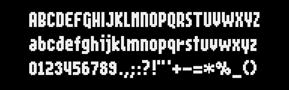
hey! i’m loving this font, but i think the plus sign kinda falls short of reading like a plus sign? here’s its use in context
would it be possible to fix this? or are there steps i can take to fix it on my end? i know almost nothing of font development so it’s a bit challenging for me :/
Oh, I see what you mean: that plus sign is a little too minimalist eheh. No worries, I'll update the font ✨
EDIT: done, fixed in v2.1
thank you!!! it looks great!